Well, its not just a sticker, but the typography and part of the color for my project too. More to come.

Well, its not just a sticker, but the typography and part of the color for my project too. More to come.
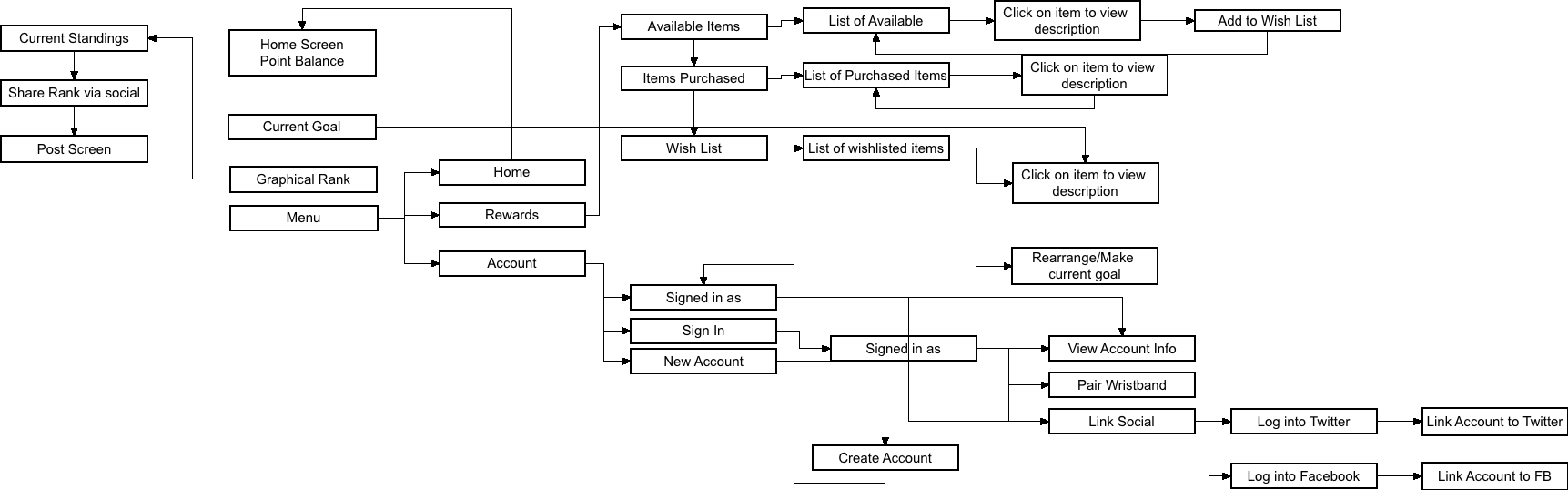
I like to use flow charts to visually plan out flows before creating wire frames. It’s something I picked up from working with engineers at DISH. I’m not sure I’ve ever seen anyone at school use a flow chart app to do this; sure, people use Illustrator or other graphics programs, but c’mon they don’t have linked associations you can move around while staying linked to each other. Even though my flowchart may lack the graphical sophistication, I find it easier to work this way.
So check out my flowchart if you’d like, or don’t. Wireframes to follow shortly.
Hell, I’d pay for an upgrade to a nice wristband! Not that the graphic ribbon style of the past few years is bad, but they do tend to get pretty skanky after a just a day.
and that is a damn you of jealousy. Looks like some of my ideas for thesis are being implemented at Coachella this year. Which means, my ideas are good enough for a world class festival. I just need to get them out there before someone else does.
Sounds so easy doesn’t it?
And how fucking AWESOME is their website? I just noticed the other day that in addition to the balloons swaying, the ferris wheel spinning and other tiny little animations, the site changes depending on the time of day too! If you visit it during the day, the little animations of the festival grounds are shown as if it were day time, and the colors of the site are daylight themed. If you visit the site at night, the colors are more night sky-ish and the animations are “lit up”, just as they are if you were there.
Check it out. so awesome. Coachella
I’m posting my analysis of the more qualitative elements of my thesis survey. Specifically, I looked more closely at the reasons people gave for participating or not in recycling programs.
The results were a little bit surprising to me, in that I thought lack of participation was a result of difficulty in use of these programs. But, in fact, based on the responses I got, it was not difficulty, but primarily lack of awareness of the programs themselves.
If you’d like more details, check out my full analysis here: ParticipationReasons
I’m posting my survey result data in case anyone would like to take a look. Although I wish I had gotten more responses the results are still pretty interesting.
Take a look a the data summary tab to see most of the data in chart form.
Enjoy! 20140305_SurveyResponses
So, if you’ve met me in person, you probably know I’m pretty shy and fairly social awkward until I get to know you. It’s all part of being an introvert. Another part of being an introvert is I’m not as good at reading non-verbal cues or subtexts in conversations, so it usually takes me bit to think over and process new ideas, concepts I don’t fully understand, and hell, sometimes even ones I do understand. This results in some pretty confused and blank looks from me in classes and meetings, despite the fact I perfectly understand the words someone is saying, I just might not fully process the meaning of those words until later.
So, that’s what faculty meetings about my thesis have been like for me. But you know what, I’m starting to get it.
DeLevie, I understand what you were saying about branding now. There is an element of it that should be addressed in my thesis. I just wasn’t as interested in the ideas of branding, so was trying to avoid them. Nope, can’t do that, and the results of my research to date have shown that branding of recycling programs is a large part of people not participating. So, yes, I will be revising/adjusting my thesis question based on this. I told you I’d understand a few hours later!
So, moral of the story is, yeah, I give blank looks a lot, but it doesn’t mean I mentally checked out. Usually it means my brain is racing trying to take in all the new information, and can’t process anything else. Processing…Processing…Processing.
Peeps who have attended music festivals, please take my survey for my senior thesis project! It is anonymous and you’ll help me graduate from college. 🙂
Survey Here
The Tranquility Pod A waterbed pod with a sound system, vibration, and led mood lighting that syncs to your heart rate. Insert sexy-time joke here.
Struggling with whether or not I should frame my thesis as a UX or Interactive Design project. I’m leaning towards UX because I think my strengths lie more in research than coding. BUT, I am making an app, or at least a smoke and mirrors app. So which is it?
Honestly, my passions lie more in UX, because things don’t have to suck as much as they do. For example: Why do websites ask for the credit card type on their payment screens? They can tell by the first number on the card what type it is, why make people enter it? Or: why do cable and satellite box UIs suck so hard? Seriously. It’s so easy to do good design, you don’t even have to come up with your own ideas most of the time, your audience tells you a good chunk of that.
But, then there’s the whole I’m creating an interactive experience, soooooooooo confusion.
Guess I better decide today.